info@biomedres.us
+1 (502) 904-2126
One Westbrook Corporate Center, Suite 300, Westchester, IL 60154, USA
Site Map
Received: February 12, 2024; Published: February 20, 2024
*Corresponding author: Töysa T, Licentiate of Medicine, Specialty General Practice, Iisalmi, Finland
DOI: 10.26717/BJSTR.2024.55.008663
‘Native’ data of Finnish coronary heart disease mortality (CHD) of rural (rur) and urban (urb) subgroups
available only by 3-year means, 3ym, from period 1951-87, (for calculation: 1952-88) revealed, that male
(M) (M.CHD.rur) in period 1952-77 associated positively with smoking, consumption of alcohol and sugar,
but negatively with milk fats), oppositely to (female) F.CHD.rur and F.CHD.urb and mainly oppositely with
M.CHD.urb and pig microangiopathy (MAP) (mortality). Numerical evaluation was challenging, especially
because CHD’s showed visual similarities. For explaining such a situation is earlier presented a method
using “proportional deviations of parameters from their own exponential trendlines” (pd) between start
point (α) and end point (ω). Pd data, as well as ‘native’ data, are here analyzed through Pearson correlations,
regressions and visual charts by three periods 1952-86, 1952-77 and 1963-86 (3ym). A ready calculator is
presented for producing pd data.
Results: Periodical Pearson correlations between M.CHD and F.CHD data of middle-aged people in rural
regions with ‘native’ [and pd] data were in 1952-86 +0.22 [+0.91], 1952-77 -0.32 [+0.95] and 1963-86 +0.91
[+0.82]. Periodical means +0.27 [+0.89], SD +0.50 [+0.05].Associations between M.CHD.rur and F.CHD.rur
were inverse in period 1952-77, opposite to other periods. ‘Native’ data showed highest reciprocal association
in period 1963-86 (+0.91), pd data in 1952-77 (+0.95).
Summary: Pd data [based on proportional deviations from exponential trendlines between start (α) and
end points (ω)], via their Pearson correlations, regressions and visual charts can give a new (?) method to
evaluate similarity, especially simultaneousness in variation and possibly “pick up” some details, undetectable
by linear regression analysis with native data.
Keywords: Statistical; CHD Subgroups; in 1952-86; Alcohol; Sugar; Tobacco; Milk Fat; Females; Males
Abbreviations: α: The First Year of a Period; B: Column of Years; B.i: Coincidental/Casual Year; CHD: Coronary Heart Disease; C.α: CHD.α: CHD During the First Year of the Period in Concern; Post-fix e: Exponential Trendline, e.g. F.CHD.rur.e.(63-86); F: Female; Value for Exponential Tendline in i: Fe.(CHD.i) = POWER[(10,E$8*(B.i- B.α)]*C.α; (F: female, M: Male; pd: Explained in the Next Chapter (Parameters for pd Calculators); rur: Rural; urb: Urban; V: Variable, in this Article CHD; CHD; ω: The Last Year of a Period
Pd data [based on proportional deviations from exponential trendlines between start (α) and end points (ω)], via their Pearson correlations, regressions and visual charts can give a new (?) method to measure similarity especially simultaneousness in variation and possibly “pick up” some details, undetectable by linear regression analysis with native data.
year = yr = i, α≤i≤ ω
Exponential trendline equation for CHD.i:
Fe.(CHD.i) = POWER[(10,E$8*(B.i-B.α)]*C.α
E$8: fixed E8 = [log10(CHD.ω) - log10(CHD.α)]/(ω – α)
B.α: start year: (fixed) B.α = B$10 (for 1952) or B$21 (for 1963)
B,ω = end year: 1986 in period 1 & 2, 1977 in period 2
B.i = (non-fixed year) = B.α ≤ B.i ≤ B.ω. [it is changing by drawing
with mouse on column D].
C.α = CHD.α = (fixed) CHD.α = C$10 for 1952 or C$21 for 1963
(values by 3-yer means)
pd.i = proportional deviation from exponential Trend-line point i
(in percents) = [CHD.i – Fe.(CHD.i)]/Fe.(CHD.i)*100.
Rural male CHD (mortality) (M.CHD.rur) associated highly differently with environmental and behavioral factors to other cardiac mortality subgroups [1,2]. It seemed to need explanation, which is partially given in [3]. The difference was highest in period 1952-77, when M.CHD.rur associated with behavioral (alcohol, tobacco, milk fat and sugar consumption) and environmental (Mg/K and Mg/Ca fertilization) factors oppositely to F.CHD.rur and F.CHD.urb. The opposite statistical behavior of M.CHD.rur was nearly the same with M.CHD. urb and Pig MAP (microangiopathy, autopsy data) [2]. Possible causes are inside each factor: amount of exposure and delay from predisposition to measured signs (mortality in CHD or Pig MAP) and difference in protecting factors or even limitations in linear assessments (e.g. Pearson) for measuring similarity or coherence. The aim of this article is to present a method and a calculator of proportional deviations from their own exponential trendlines (pd), between start point (α) and end point (ω), graphics and numeric data by Pearson correlations, comparing them with Pearson correlations by ‘native’ data and regressions of variables (by native and pd data).
Age adjusted CHD data of middle-aged males and females in rural and urban regions during 1951-87 are attained by ruler from [1], in its fifth figure (“Kuvio”), on a logarithmic scale, by 3-year moving means (3ym). Calculations produce three-year average CHD data for period 1952-86, partially presented in [2,3]. Figure 1. M.CHD.rur and M.CHD.urb, 3ym, from 1951-87. This survey concentrates in three (calculated) periods: 1952-86, 1952-77 and 1963-86. For each period are represented 3ym data, formation of exponential trendline (e) and pd-parameters (labeled “pd” or “3ym.pd”) in numbers and figures. Additionally are presented Pearson correlations and regressions of M.CHD.rur by F.CHD.rur (with ‘native’ (3ym) and (3ym.)pd data). Regressions are calculated by IBM SPSS program. Microsoft Exel is benefited for chart forming.
Because F.CHD.urb and F.CHD.rur behave nearly similarly (as shown in Figure 2) this survey concentrates in assessment of CHD’s in rural regions.
Figure 1

Figure 2

Period 1952-86 with Calculations and Charts
Figure 3 presents age adjusted male and female CHD mortality of middle-aged people in rural regions from 1951-87 (3-year means, 3ym, are available only for years from 1952 to 1986, which are used for calculations and titles on the following pages). The Figure 3 is replaced here to help to understand the following figures, although it is a part of given materials. Figure 4 shows M.CHD.rur and its proportional exponential trendline [e], between 1952 and 1986. Figure 5 shows F.CHD.rur and its proportional exponential trendline [e] between 1952 and 1986. In Figure 6. M.CHD.rur.3ym.pd shows negative values (i.e. below the trendline) in 1952-58, less than F.CHD.rur.3ym. pd, which shows negatine values in 1952-61 and 1983-86. Figure 7 shows M.CHD.rur.3ym and its regression by F.CHD.rur.3ym in 1952- 86, R square 4.6 %, p = 0.215 (SIC!), i.e. non-significant). Positive association (R = +0.215 (SIC!)). Figure 8 shows M.CHD.rur.3ym.pd and its regression by F.CHD.rur.3ym.pd in 1952-86. R square 83 %, (p = 0.000).
Figure 3

Figure 4

Figure 5

Figure 6

Figure 7

Figure 8

Table 1: M.CHD.rur and F.CHD.rur by three-year moving means, their exponential trendlines (e) between start (α) with and end points (ω) and pd-values (%) from 1951-87.

Period 1952-77 with Calculations and Charts (Table 2)
Figure 9 and Figure 10 show rural CHD mortality (3ym) of both genders between 1952 and 1986 and exponential trendlines [e] with end points (ω) at 1977. Figure 12 Male and female CHD.rur.pd show concurrent negative values between 1952 and 1961, after that mainly positive until 1977. Figure 12 Regression of M.CHD.rur explained F.CHD.rur negatively by 10.3 %, i.e. “worse than by 0 %” (R = -0.32). Figure 13 M.CHD.rur.pd was explained 90.6 % by F.CHD.rur.pd. R = +0.95 (p = 0.000).
Figure 9

Figure 10

Figure 11

Figure 12

Figure 13

Table 2: CHD mortality in rural regions amongst middle-aged males and females by three-year moving meanstheir exponential trendlines (e) between start and end points (α and ω) and pd’s (%) in 1952-77.

Period 1963-86 with Calculations and Charts (Table 6)
Figure 14 and Figure 15 show rural CHD (3ym) of both genders between 1952-86 with exponential trendlines [e], α = 1963, ω = 1986. Figure 16 shows development of male and female CHD.rur.3ym. Figure 17 shows development of male and female CHD.rur.3ym.pd. Figure 18 shows M.CHD.rur.3ym and its regression by F.CHD.rur.3ym in 1963-86. (R square 82.2 %, p = 0.000). Figure 19 shows M.CHD. rur.3ym.pd and its regression by F.CHD.rur.3ym.pd. (R = +0.82, R square 67.7 %, p= 0.000).
Table 3: CHD mortality in rural regions amongst middle-aged males and females by three-year moving means their exponential trendlines (e) between start and end points (α and ω) and pd’s (%) in 1963-86.

Figure 14

Figure 15

Figure 16

Figure 17

Figure 18

Figure 19

If we have only Pearson correlation coefficient (-0.32) on the association between M.CHD.rur and F.CHD.rur in 1952-77, or M.CHD.rur regression by F.CHD.rur (Figure 12) (without Fig 3), it is uncommon to guess, that they can have a plenty of similarities as is seen: CHD decrease 1952-56, continuous increase 1958-62, resistance against decrease in 1964-68 and 1964-77, but not enough to make the Pearson correlation positive. Anyhow in deviations from trendlines they showed similarities. Pearson correlation of pd data was +0.95, (F.CHD. rur.3ym.pd explained M.CHD.3ym.pd by 90.6 %) (Figure 13).
Valkonen & Martikainen have presented even annual (‘orig’) age-adjusted CHD mortality data of middle-aged Finnish males and females on logarithmic scale concerning period 1951-87, the first figure (“Kuvio”) in [1]. The data has been measured by ruler and calculated to linear scale and adjusted by CHD data from Statistics Finland [4]. The data are ready for use in [5], here benefited only ad 1986, in order to be better comparable with Figure 8. The data have then been manufactured by pd calculator as in the Table 1.
After that is made regression analysis of M.CHD.pd by F.CHD.pd. Figure 20 shows M.CHD.pd and its regression by F.CHD.pd (R = +0.94, R square 89 %, p = 0.000). In 1952-86 regression of M.CHD.rur.3ym. pd by F.CHD.rur.3ym.pd R square was 82.6 %, which is not a surprise because of smaller population (not the whole Finland). The male-female annual compliance is surprisingly high in details. In 1975-77 is seen increase in M.CHD, not in F.CHD, invisible in M.CHD.3ym’s. It has time related association with rapid reduction in smoking since 1974 [2]. Generally is known that most smokers were men. but the mortality increase was minor and this figure can exaggerate. The obvious vascular benefits of non-smoking could have been coming with delay, but then in hurry. Figures 1, 2 and 20 can arouse ideas on causal mechanisms, too, outside of the title of this article.
PubMed search by “proportional deviation from exponential trendline” gave no results.
Figure 20

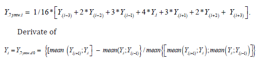
Pd data [based on proportional deviations from exponential trendlines between start (α) and end points (ω)], via their Pearson correlations, regressions and visual charts can give a new (?) method to evaluate similarity, especially simultaneousness in variation and possibly “pick up” some details, undetectable by linear regression analysis with native data. PS. The pd method/experiment is resembling an earlier “7ymw-experiment”, skizze, in [6]: Figure 5 presents derivative changes of (K/ Mg).fm and nCHD are got via their “7 year mean weighted means” (7ymw):
nCHD = non-CHD = Total mortality minus CHD.
It worked in this Figure, but not in several materials. Possibly
sometimes.
I am grateful to Tapani Valkonen for the permission to use his data and one postage stamp.