 Research Article
Abstract
In the process of this paper, we started with the data from 2010 to 2017 provided by NFLIS concerned with opioid crisis in the US. After sorting and analyzing the panel data, we decided to transform the derived data and then model the panel data, cross-section data and time series data respectively. Next, we consider how to objectively select a large number of socio-economic data and indicators, and then establish a model that can reflect two different databases at the same time, so that the model can be combined with some indicators. Finally, we propose a feasible strategy to resist the opioid crisis.
Keywords: Dynamic Panel Data Model; Systematic Cluster Analysis; Correlation Analysis; Weighted Principal Component analysis
Introduction
The United States opioid epidemic is a nationwide public health crisis. Opioids are prescription drugs, and three-thirds of the deaths from opioids die each year from opioid prescription drugs. Heroin is one of the most highly dependent substances in opioids. It is more addictive than any other drug and is loved by addicts. Although heroin mortality is high, it is still difficult to control [1]. Since President Nixon launched a large-scale anti-drug operation in the late 1960s, successive US administrations have made unremitting efforts in combating drug smuggling and controlling the spread of drugs. They have also set up the Narcotics Bureau to kill drugs from the root causes. According to statistics, an average of 40 people die every day in the United States due to overdose of opioids.
This number has tripled since 1999 [2]. The National Drug Use and Health Survey (NSDUH) of the US Drug Abuse and Mental Health Service Management (SAMHSA) shows that in 2016, more than 11 million people in the United States abused opioid prescription drugs and nearly 1 million people used heroin. All of the above indications indicate that the use of opioids in the United States has caused serious social problems. The real need for the United States to face up is the growing gap between the rich and the poor, the inability to make ends meet, and the low-education employment opportunities.
Methods
We discuss the extent of opioids flooding, and establishes a dynamic panel data model for characterization and prediction of crisis, using generalized moment estimation and time series analysis to solve the model; the grey relational analysis is carried out to judge whether the use of opioids is related to population data, and the principal component evaluation model is established to verify the results; the linear programming model was analyzed using the sensitivity analysis for the validity of the test strategy. First, a multi-dimensional descriptive statistical analysis of the data, and found the geographical distribution of opioids. The data was organized into panel data. On the one hand, the dynamic panel data model was established, and the parameters were estimated by generalized moments. It was concluded that the heroin should first appeared in 1910, OH-HAMILTON and synthetic opioids first appeared in 1939 PA-PHILADELPHIA. On the other hand, the Hierarchical Cluster based on the panel data of “absolute quantity”, “fluctuation”, “skewness”, “kurtosis” and “trend” feature extraction is used to find out the five counties that need the most concern in the US.
And time Series Analysis was used to find the year when these counties reached the drug threshold, and the threshold level was obtained by the dynamic panel data model. For example, the threshold for the number of synthetic opioid cases in OH-CUYAHOGA in 2018 was 6783. To judge whether the use of opioids is related to US population data, use gray correlation analysis to find the ratio of the number of heroin and synthetic opioid cases in the county to the total number of identified substances. The correlation between the two and the selected first-level indicators from the population data is greater than 0.5, indicating that the degree of association between them is greater. To verify the five counties that may cause the US to panic, the entropy weight method is used to select 16 indicators, and the indicators in the NFLIS are combined to establish a comprehensive evaluation system for the degree of opioid flooding and principal component evaluation model. The comprehensive weighted scores were used as the class of opioid flooding scores, and the 461 counties in 8 years were distributed according to the frequency distribution of F values, and the degree of opioid abuse was divided into three levels: severe, general and lower.
We propose the strategies for combating the opioid crisis: the US can stipulate that all people must have completed the 12th grade compulsory education when they are 25 years old. To test the effectiveness of the strategy and determine the range of important parameters, a sensitivity analysis of linear programming was used. Taking min F1 as the objective function, a constraint condition is formed between the 20 indicators, and the parameter range (c,k) of each index is obtained by local sensitivity analysis. The obtained parameter range is brought into the first principal component expression, and it is determined whether the parameter range is valid according to the level of the F1. In the end, the parameters of high school education, university but no degree and university degree and above are correct (0,0.2637), (0.2615,1), (0.2615,1), and the flood levels of the four counties are correct. Has been reduced to a lower level, only Hamilton County, Ohio’s hazard level reduced to a general conclusion, which shows that the strategy is effective.
Biomathematical Model Establishment and Solution
Biomathematical Modelling
Multidimensional Descriptive Statistical Analysis Model: This study investigates the data concerned with opioid crisis from 461 counties in the five states from 2010 to 2017, with a total of 24,063 samples and 61 substance name.
a) Counties: The data can be sorted out. In the 461 counties, not every county has an incident report every year. The reason may be that the data of the current year is difficult to obtain, or the data of the year is 0, so it is omitted. However, we believe that either case can indicate that the county’s drug abuse has not reached a serious level. Combined with the data of each county, the counties with missing data have fewer drugs in the few years with data, close to zero, so we fill the value of the drug that was missing in the county from zero.
b) Substance Name: The name of the substance identified in the analysis contains 47 synthetic opioids and 13 non-synthetic opioids, these 13 non-synthetic drugs are Codeine, Dihydrocodeine, Acetylcodeine, Acetyldihydrocodeine, Morphine, Heroin, Hydromorphone, Oxycodone, Oxymorphone, Buprenorphine, Hydrocodone, Nalbuphine, Dihydromorphone.
c) YYYY & FIPS_ Combined: The time and county code data are all integers, and the distance between the data is the same, so the two columns of data are logarithmically transformed to make the data better visualized, and the difference between the two columns is small, especially year. Therefore, the logarithmic transformation is performed with a base of 1.1.
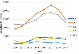
The overall trend of the number of drugs in the five states from 2010 to 2017 and the overall trend of the number of heroin were analyzed. The resulting bar chart is shown in Figures 1 & 2. It can be seen intuitively from Figure 1 that the total number of drugs in KY and OH states is far greater than the other three states. Among them, the OH state has increased year by year, the PA state has decreased year by year, the VA state has fluctuated greatly, and the KY state and the WV state have stabilized at a lower value. As can be seen from Figure 2, the number of heroin in these five regions increased first and then decreased over time. The turning point is probably in 2015, and the number of heroin in OH and PA states is much higher than in the other three states. Therefore, PA State and OH State are the targets of key observations.
a) Before surgery
b) 6-month post-surgery
Figure 1: Changes in the number of drugs in five states.
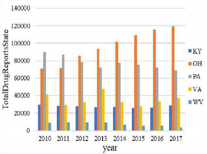
Figure 2: Changes in the number of heroin.
Further analysis of the change in the proportion of the substance identified in the analysis from 2010 to 2017, the resulting percentage of the accumulated area is shown in Figure 3. The greater the proportion of color in the percentage stacked graph, the greater the proportion of the substance in the analysis. It can be seen from Figure 3 that heroin (dark brown part of Figure 3) accounts for the most, nearly half. Followed by Oxycodone (light grey), the proportion of other substances is much smaller than heroin. Continue to observe the geographical distribution of the number of heroin, as shown in Figure 4. It can be seen from Fig. 4 that heroin is concentrated in five counties, and the codes according to the distribution order (FIPS) are 39035, 39061, 39113, 42003, 42101.
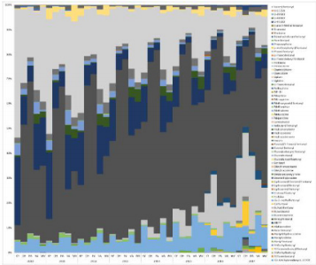
Figure 3: Percentage stacked column chart.
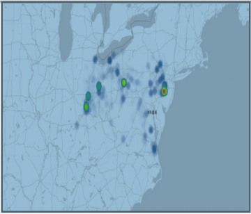
Figure 4: Geographical distribution of opioids.
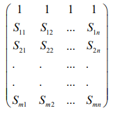
The Establishment of Dynamic Panel Data Model: The data given in the title is multi-indicator panel data. In order to facilitate the observation of indicators, the data is organized into the form of Table 1. Strictly speaking, it should be represented by a three-dimensional table. For ease of understanding and explanation, the following two tables are still used. As shown in Table 1, there are a total of N samples in the study. Each sample has T records and p indicators per period. Then the value of the j-th indicator of the sample i in the t-th period is X t ij ( ), where i Nj pt T = = = 1, 2... 1, 2... 1, 2... , the difference between this table and the simple two-dimensional table is that it contains three-dimensional information such as time, sample and indicator.
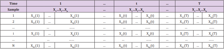
Table 1: Multiple indicator panel data.
Data Pre-processing: The data of time and county code are integers, and the distance between the data is the same, so the two columns of data are logarithmically transformed to make the data better visual, and the difference between the two columns is small, especially time. Therefore, the logarithmic transformation is performed with a base of 1.1.
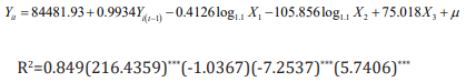
Dynamic Panel Data Model Establishment: Since the title requires determining the earliest position used by the specific opioid, the quantization model is prioritized to incorporate the position as a variable into the model to solve the earliest position. Therefore, the regression model is used. The initial model is as follows
Among them, Y represents the number of drugs identified in each county, X1 represents the code of each county, X2 represents time (yearly), and X3 represents the ratio of the number of identified drugs in each county to the total number of confirmed drug cases in the county for we believe that the ratio can reflect the degree of development of drugs to some extent.
Considering the inducibility and infectivity of drugs, the drugs that lag behind the first phase should have an impact on the previous period. Therefore, the lag phase is included as an explanatory variable in the model, and the first-order lag variable is considered. Since the explanatory variables contain both time variables and regional variables, and cover both time series data and crosssection data, the dynamic panel data model is finally adopted. Since the number and proportion of drugs have zero values, the initial model (3.1) is adjusted as follows.

where Yit the number of drugs identified in the t-th year of the i-th county
Model Solving and Analysis: In the dynamic panel data model, due to the existence of the lag-interpreted variable, it is possible that the explanatory variable is related to the random error term, so that the estimators obtained by using OLS and GLS are biased and non-uniform. Ahn and Schmidt (1995) and Judson and Oewn (1999) used Generalized Moments (GMM) to study the parameter estimation of the dynamic panel data model, the statistical properties of the estimates and the model checking methods [3]. The core idea of GMM estimation is to use tool variables to generate corresponding moment conditions.
According to the estimation idea of GMM, the model (3.2) is estimated by EVIEWS software, and the hysteresis order is determined according to whether the t-test of the parameter estimation has robustness. The result is as follows.
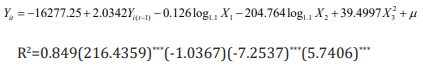
a) Section 1: Heroin
It can be seen from the above formula that the adjusted R square is 0.849, and the fitting effect is general, and X1 does not pass the 10% t test. However, the correlation matrix shows that there is no multicollinearity between X1 and other explanatory variables, so the data is adjusted to raw data. The model is improved as follows.
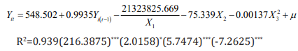
Among them, the t-statistic is in the brackets, *** indicates that it is significant at the level of 0.05, and * indicates that it is significant at the level of 0.1. Except for the dynamic panel data model, the county code is significant at the level of 0.1, and other estimates are significant at the 0.05 level, indicating that the regression effect is good.
b) Section 2: Synthetic Opioid
It can be seen from the above formula that the adjusted R square is 0.949, and the fitting effect is good, and each explanatory variable has passed the significant level of 0.01. The earliest appearance of opioids must have never appeared before and began to grow after emergence. Therefore, the panel data model can be used to make Yit=0, then Yi(t-1) and ratio are 0. To find the earliest position, we hope that the year is as small as possible. We have obtained a quantitative relationship between the area and the number of drugs, so that the year can be reduced in turn, and the corresponding county codes are obtained separately. In the case of Heroin, when the year is reduced to 1910, the corresponding county code is 39061. When the year is reduced to 1909, the county code has been reduced to four digits, which is inconsistent with the data.
Therefore, 1910 is considered to be Heroin. Because of the earliest year, the earliest position corresponding to the occurrence is 39061 (OH-HAMILTON). The earliest appearance time of synthetic opioids is 1939, and the earliest position is 42101 (PAPHILADELPHIA).
Time Series Model Based on System Clustering
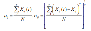
Five Feature Extraction of Panel Data: Several statistics for the multidimensional indicator panel are given below, and the statistic feature extraction will use these statistics. The mean and standard deviation of the j th indicator T period of sample i are:
a) Standardization of Panel Data
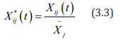
Due to the difference in the dimension and magnitude of the indicator, it will have an impact on the final analysis results. Therefore, the standardization process of the mean of Xij (t) is first performed, and the standardized data is set to Xij * (t), and the standardized formula is due to the difference in the dimension and magnitude of the indicator, it will have an impact on the final analysis results. Therefore, the standardization process for the mean value is first set, and the standardized data is
among them, 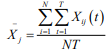 ,after standardization, the mean
value of each indicator is 1, and the variance is
,after standardization, the mean
value of each indicator is 1, and the variance is
The variance of each index after such standardization is the square of the coefficient of variation of each index, which not only eliminates the influence of dimension and magnitude, but also retains the variation information of the original indicator.
b) Feature Quantity Extraction of Panel Data Indicators
According to the extraction of the feature quantity of panel
data in the literature [4], this paper defines the feature quantity
sof each index during the inspection period from the aspects of
development level, trend, fluctuation degree and distribution of the
indicator period. For the panel dataset  , there are N samples,
each sample records T, and there are p indicators in each period.
, there are N samples,
each sample records T, and there are p indicators in each period.
i. Definition 1: The jth indicator of the sample i is the fulltime Absolute Quantity Feature, abbreviated as AQF(Fij)
AQF (Fij)is actually the mean of the jth indicator of sample i over the total period T, which reflects the absolute level of development of the jth indicator of sample i in the analysis time domain (over the entire period).
ii. Definition 2: The jth indicator of the sample i is the fulltime “Variance Feature”, abbreviated as VF(Fij)then

Among them,  in definition 1, which
reflects the degree of fluctuation of the jth index of sample i over
time.
in definition 1, which
reflects the degree of fluctuation of the jth index of sample i over
time.
iii. Definition 3: The jth indicator of the sample i is the fulltime Skewness Coefficient Feature, abbreviated as
Where, 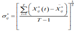 represents the standard deviation of the
jth index of the sample i over the entire period, SCF (Fij) reflects the
degree of symmetry of the jth index of the sample i over the entire
period, SCF F( ij)˂ 0, indicating that most of the index is located to
the right of the average, SCF (Fij)˂ 0, indicating that most of the
indicators are located to the left of the average.
represents the standard deviation of the
jth index of the sample i over the entire period, SCF (Fij) reflects the
degree of symmetry of the jth index of the sample i over the entire
period, SCF F( ij)˂ 0, indicating that most of the index is located to
the right of the average, SCF (Fij)˂ 0, indicating that most of the
indicators are located to the left of the average.
iv. Definition 4: The jth indicator of the sample i is the Kurtosis Coefficient Feature, abbreviated as KCF(Fij).
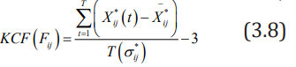
KCF (Fij) reflects the sharpness of the distribution curve of the jth indicator of sample i over the entire period. KCF (Fij) ˃ 0 indicates that the distribution of the index value is more dispersed than the normal distribution, and KCF (Fij) ˂0 indicates that the distribution of the index value is more concentrated around the average value than the normal distribution.
v. Definition 5: The jth indicator full-time “Trend Feature” of sample i, abbreviated as TF(Fij), the long-term trend of the TF(Fij) indicator. If the TF(Fij) value of the indicator is closer, it means that both indicators show the same slope change and the closer the two indicators are.
Indicator Selection
According to the previous analysis of the data and the variables of the demand, feature extraction of the following indicators: Heroin, non-synthetic opioids, Synthetic opioid, opioids, Total Drug Reports County
Extraction Results
Take the Absolute Quantity Feature as an example. The final data obtained is shown in Table 2 below. In order to visually see the data characteristics of different indicators in the time dimension between the county and the county, take the Absolute Quantity Feature as an example and make an observation chart of five indicators. The obtained line chart is shown in Figure 5. The abscissa in Figure 5 indicates (total coding) FIPS_ Combined, the ordinate indicates the AQF value corresponding to each county, and Figure 6 is a partial enlarged view of Figure 5. As can be seen from Figures 5 & 6, the fluctuations of these indicators are similar. Explain heroin, non-synthetic drugs, synthetic drugs, opioids, total drug counts in Total Drug Reports County. These indicators have similar development levels throughout the period from 2010 to 2017, and each county has its own characteristics.
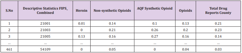
Table 2: Absolute Quantity Feature.
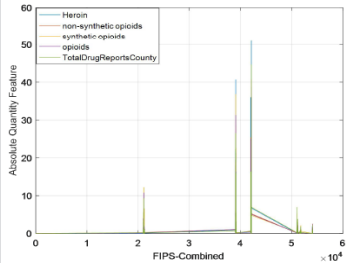
Figure 5: AQF.
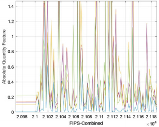
Figure 6: AQF(part).
Cluster Data Clustering Results
The five characteristics extracted from the panel data index were systematically clustered with heroin and synthetic opioids. The obtained pedigree map is shown in Appendix’s 1-4. The systematic clustering results of synthetic opioids and the systematic clustering results of heroin. Consistent, see Appendix 2 for details. The clustering results are shown in Table 3. The results of the two system clusters pointed out that the five counties, CUYAHOGA, HAMILTON, MONTGOMERY, ALLEGHENY, and PHILADELPHIA, are the two counties with the largest number of heroin cases and the most counties with the largest number of synthetic opioid cases. Counties are the top priority areas in the United States that require major concerns.
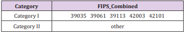
Table 3: Clustering result.
Time-Series Model: The panel data includes time series data and cross-section data. We have obtained five key counties (39061, 39035, 42101, 39113, 42003) in the previous section. Now we analyse the time and space characteristics of the data in these five counties. Based on the extracted features for clustering, the clustering results have depicted the absolute number of specific drugs from this perspective. To extract more relevant information from the data provided by NFLIS, we use the county’s specific drugs and the county’s total The ratio of the number of drugs is derived data, and time series analysis is performed. The final results of the 2010-2017 consecutive year time series analysis of the heroine ratio and the synthetic opioid ratio of the five counties in the five counties are shown in the following Table 4.
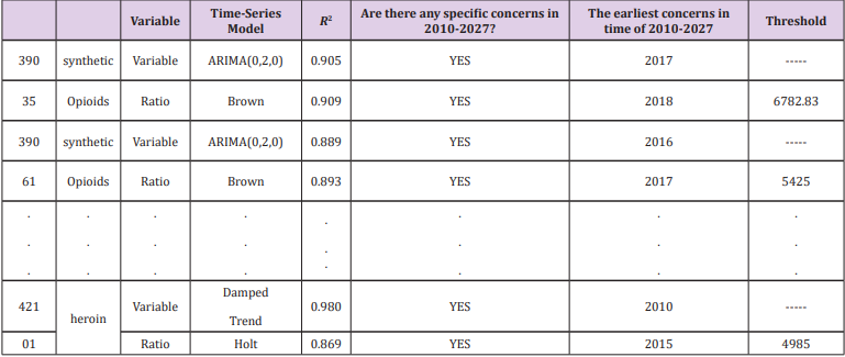
Table 4: Time series analysis results.
Reference [5] mentions the statistical analysis of data from previous years, The number of cases of abusive use of opioids in a state accounted for about 20% of the number of cases of drug deaths in the state, which already reflects the seriousness of the abuse of opioids. We borrowed this ratio to indicate that when a county’s abuse of opioids accounted for 20% of the number of drug use cases in the county, it indicated that the situation was critical and relevant government departments should pay great attention to this. Therefore, the arguments such as the position of the sequence indicating the “ratio” and the year when the ratio reaches 20% are brought into the dynamic panel data model, and the critical value of the independent variable Yit , that is, the threshold of the corresponding sequence can be obtained separately
Principal Component Evaluation Model Based on Entropy Weight Method
Data Analysis and Processing: We need to analyze the common variables of the counties shared by the seven-year data, and by comparison, we find that each observation has four forms (Estimate; Margin of Error; Percent; Percent Margin of Error), and what we need is the estimated amount, and the variables and counties in the annex from 2010 to 2016 are not exactly the same. The data of the four tables from 2010 to 2013 are the same as the individuals, and the variables of the three tables are the same as the individuals from 2014 to 2016. For example, from 2010 to 2013 (county code) GEO.id2 has 51515, and the county code from 2014 to 2016 does not have this county. From 2010 to 2013, there are no variables (COMPUTERS AND INTERNET USE - Total Households, COMPUTERS AND INTERNET USE - Total Households - With a computer, COMPUTERS AND INTERNET USE - Total Households - With a broadband Internet subscription).
Therefore, the relevant individuals of 51159, 51161, 51685 in the variable GEO.id2 are deleted. In the same way, the variables common to the seven years are screened for analysis. After the above treatment, 149 variables and 464 samples (counties) were obtained. And we need to analyse the data of the first question. And similarly, screen out the same county in the first two questions, and finally get 460 samples. After excluding the variables with unreasonable estimates and error ranges, we will select the variables we need from the remaining variables according to the literature and topic requirements, and finally get 21 variables to classify the data such as educational achievements. Variables of less than nine years and education levels of nine to twelve years are aggregated, new indicators are obtained for education levels below 12 years, and so on, and the four key points included in the first question are included. From the variable to the second question indicator, the last 22 variables selected initially are shown in Appendix 6.
Grey Correlation Analysis: There are known information in the objective world, as well as many unknown and unconfirmed information. Known information is white, unknown or nonconfirmed information is black, and between the two is gray. The grey concept is the integration of the concepts of “less data” and “information uncertainty”. The grey system theory is aimed at this kind of uncertainty problem with neither experience nor information, that is, the problem of “less data uncertainty”. The grey system theory regards the uncertainty as the amount of gray. In essence, it is a mathematical theory to solve the uncertainty theory of information deficiency.
Because the gray system has less data and incomplete information, it is difficult for decision makers to determine the quantitative relationship between factors. It is difficult to distinguish the main factors and secondary factors of the system, thus introducing the gray correlation analysis method. A comprehensive evaluation method based on the grey system theory--grey correlation analysis method is to measure the degree of correlation between factors according to the similarity or dissimilarity between the developmental trends of factors and quantifies or orchestrate the factors between systems with incomplete information. According to the theory of grey relational space, the original data needs to satisfy the dimensionless or the same dimension. In this paper, the extremum method is used to dimensionize the original data, and the processed data is combined with the ideal object data column to obtain a new matrix:
Record Si = (Si1,Si2,....,Sin),i=0,1,....,m,S0 as the reference sequence, and calculate the correlation coefficient layer βi ( j) of the jth index of Si and the jth index of S0(i = 1, 2,....,m; j = 1, 2,...,n ) ,
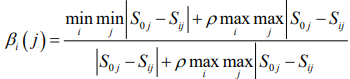
In the above formula ρ ϵ [0,1], generally takes ρ=0.5
By calculating as above, the correlation coefficient matrix β is obtained:
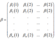
Let 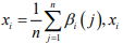 is the degree of association between the i-th
evaluated object and the ideal object. The merits of the object to
be evaluated are evaluated according to the size of the xi
value.
The larger the xi
, the higher the degree of association between the i-th evaluated object and the ideal object, and thus the better it is
among all the evaluated objects. Because the topic requires judging
whether the use or use trend of opioids is related to the socioeconomic data of the census, and the part 2 data shows the rules of
the first-level indicators and the second-level indicators, of which
there are 7 first-level indicators. Combining the use and use trends
of opioids (represented by the number of drug cases in each county
and the number of drug cases in each county and the total number
of identified drug cases), the gray correlation analysis is carried out
on 9 indicators. The correlation degree is solved by using MATLAB.
The specific procedure is shown in Appendix 3. As can be seen
from the above results, all correlations are greater than 0.5. As can
also be seen from Appendix 2, the correlation coefficient matrix
is close to 1, indicating that the use or use trend of opioids has a
strong correlation with all aspects of the population.
is the degree of association between the i-th
evaluated object and the ideal object. The merits of the object to
be evaluated are evaluated according to the size of the xi
value.
The larger the xi
, the higher the degree of association between the i-th evaluated object and the ideal object, and thus the better it is
among all the evaluated objects. Because the topic requires judging
whether the use or use trend of opioids is related to the socioeconomic data of the census, and the part 2 data shows the rules of
the first-level indicators and the second-level indicators, of which
there are 7 first-level indicators. Combining the use and use trends
of opioids (represented by the number of drug cases in each county
and the number of drug cases in each county and the total number
of identified drug cases), the gray correlation analysis is carried out
on 9 indicators. The correlation degree is solved by using MATLAB.
The specific procedure is shown in Appendix 3. As can be seen
from the above results, all correlations are greater than 0.5. As can
also be seen from Appendix 2, the correlation coefficient matrix
is close to 1, indicating that the use or use trend of opioids has a
strong correlation with all aspects of the population.
Principal Component Evaluation Model Based on Entropy Weight Method: According to the idea of information entropy, entropy is an ideal scale when evaluating the index weight of indicator system. The principal component analysis method has a good dimensionality reduction processing technology, which can transform multiple indicators into several uncorrelated comprehensive factors, and the comprehensive factor variables can reflect most of the information of the original index variables, which can better solve many problems. Requirements for indicator evaluation. Therefore, a principal component evaluation model based on entropy weight method can be established. Consider an indicator evaluation system, in which there are n evaluation indicators, m evaluated objects, and the raw data of the corresponding indicators of the evaluated objects are represented by the following matrix form.
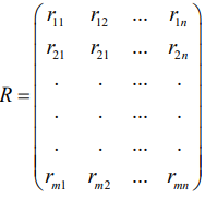
First, the raw data is dimensionless:
Remember that the optimal value for each column in R
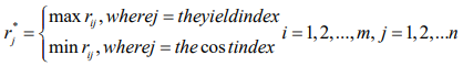
(Note: The profitability indicator is that the larger the index value, the better. The cost index is the smaller the indicator value, the better.)
After the original data is dimensionless, it is recorded as a matrix S = (Sij)mxn
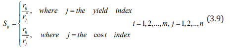
Normalize S, remember
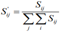
The 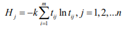 obtained in this way does not destroy the
proportional relationship between the data.
obtained in this way does not destroy the
proportional relationship between the data.
Define the entropy of the jth evaluation indicator as
Where 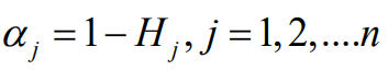 (so the chosen k is such that,
0≤Hj≤1, convenient for subsequent processing)
(so the chosen k is such that,
0≤Hj≤1, convenient for subsequent processing)
Define the difference coefficient of the jth evaluation indicator as
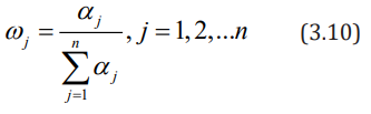
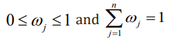
Define the entropy weight of the jth evaluation indicator as
The entropy weight thus defined has the following properties:
a) When the values of the evaluated objects on the index J are exactly the same, the entropy value reaches the maximum value of 1, and the entropy weight is zero, which means that the indicator does not provide any useful information to the decision maker, and the indicator can be considered to be cancelled.
b) When the values of the evaluated objects on the index J differ greatly, the entropy value is small and the entropy weight is large, which means that the indicator provides useful information to the decision maker, and in the problem, each object is in the There are obvious differences in indicators, which should be focused on;
c) The larger the entropy of the indicator, the smaller its entropy weight, and the less important the indicator is. The entropy defined by equation (3.10) satisfies:
It can be seen from the above discussion that the entropy weight method reflects the importance of the difference between the observations of the same indicator. The final indicators are as shown in Figure 7 below.
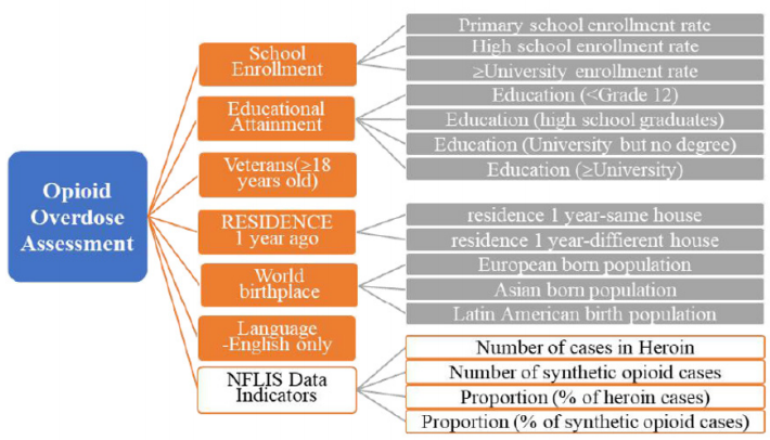
Figure 7: Opioid flooding indicator system.
Solution and Result: The above 18 indicators can be obtained by SPSS factor analysis to obtain the factor load matrix and the variance interpretation ratio (Table 5). The variance interpretation scale table is as Table 6, the first four components are extracted, and the factor load matrix is shown in Appendix 5. It can be seen from Table 6 that the first four principal components explain 85.115% of the overall properties, that is, 85% of the features can be explained according to the first four principal components. Therefore, the first four principal components are analyzed here.

Table 5: Correlation.
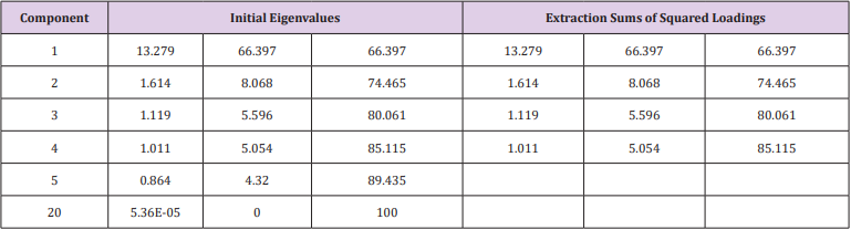
Table 6: Total Variance Explained.
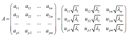
The eigenvector of the principal component is
Among them, uij represents the value of the factor load matrix, λi represents the eigenvalue, and aij represents the eigenvector. Therefore, the part of the corresponding feature vector is shown in Table 7, and the full content is shown in Appendix 5.
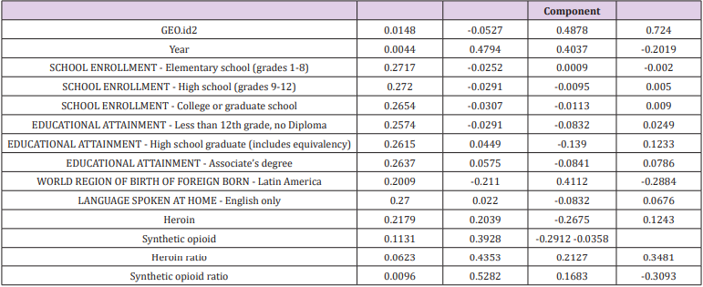
Table 7: Feature vector(part).
Therefore, the main components are:

Among them, akp represents the corresponding feature vector of the k-th indicator in the i-th principal component, and xp represents the p-th index. In the expression of the first principal component, the coefficients of the 3rd, 5th, 6th, 7th, 8th, 9th, 10th, 11th, 12th, 13th, and 16th indicators are large, and the eleven indicators play a major role, so we can Think of the first principal component as a comprehensive indicator consisting of these eleven single indicators. The second, third and fourth principal components are the same. Any event can be derived from the opioid flooding score as long as the indicator is known. For the purposes of this paper, the total score is weighted by the first four principal components, and the principal component pre-factors can be the respective variance contribution rates.
which is
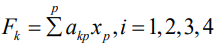
Opioid Class of Abuse Level: According to the principal component evaluation model based on entropy weight method, the algebraic value F of the opioid drug flooding score is obtained [6,7]. According to the distribution of F value, the degree of flooding of opioids is graded, and the filled area map and frequency distribution map are obtained. As shown in Figures 8 & 9. It can be seen from Figures 8 & 9 that the maximum F value is greater than 90,000, all the data falls within the interval [0, 1000000], and more are gathered in the interval [0, 450000].In order to effectively classify the degree of flooding, the interval [0, 400000] is subdivided, and the data of the degree of flooding between each cell is counted to obtain a frequency distribution map, as shown in Figure 10. It can be found that the comprehensive evaluation value of more than 3000 reports is in the interval [0, 450000], and there are almost no reports of more than 400,000. Only a few important events can be seen in Figure 8. For example, the F value of the county 42101 is 96,7854.7 which is the highest, and opioids are the most rampant. In order to further discover the level of data, the data of this interval is refined according to the step-by-step refinement analysis method and is divided into the figures as shown in Figure 10.
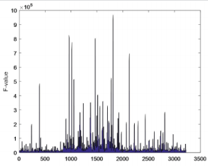
Figure 8: AQF(part).
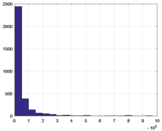
Figure 9: F-value frequency distribution.
Figure 10: Number of reports in different evaluation value intervals.
From the Figure 10, we can see the obvious hierarchical distribution. As the interval is continuously refined, it is true that a large amount of data is found between [0,50000]. As the value of F is higher, the flood is more serious. Such incidents do occur in practice, and the use of appropriate opioids occurs in all regions of the United States, so the number is large. Therefore, according to the frequency of the degree of opioid influx, the degree of opioid influx is divided into one to three levels from high to low, see Table 8. The degree of flooding of opioids in Table 8 is graded, and level 1 indicates the greatest degree of flooding. In order to verify the rationality of the classification, combined with the actual considerations, random or selected boundary values for verification, the data can meet the requirements and meet the actual facts, which also proves the rationality and accuracy of the model. At the same time, the F values of the five counties (39035, 39061, 39113, 42003, 42101) that were firstly observed were in the serious category, further illustrating the correctness of the results.
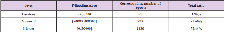
Table 8: Classification of the extent of opioids.
Linear Programming Model
The Foundation of Modexl: In question 1, we have used system cluster analysis and time series analysis to select the five counties where opium is the most widespread in the United States. In question 2, we sorted the weighted composite scores F of 460 counties, and divided 460 counties into three layers according to the order of F. The larger the value of F, the higher the extent of opioids in the county. Regarding question 3, we find that if min F is regarded as an objective function, a linear relationship can be established between the socio-economic secondary indicators used and their own primary indicators. That is, all 20 indicators used can be formed into restrictions. Further, since F1’s contribution rate is 66%, most of the information about the whole can be explained. Considering the implementation cost of the strategy, in order to make the effectiveness of the anti-opioid crisis strategy as obvious as possible, we replace minF with minF1. The linear programming model is established as follows.
Objective function:
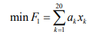
Restrictions
Among them, xk is the 20 indicators selected by Philadelphia, and ak is the corresponding coefficient (parameter).
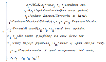
Model Solution and Sensitivity Analysis: Therefore, we can use the adjustment of an indicator xk in the constraint as a strategy against the opioid crisis. And through the local sensitivity analysis after the change of xk , the parameter range (c, k) of each index is obtained.That is, when the parameter of an indicator is in (c, k), the optimal solution does not change. It can be preliminarily understood that when the parameters of an indicator fluctuate in (c, k), the provided strategy is effective. Of course, we can also bring the obtained parameter range into the first principal component score expression to find a new F1 value, and determine whether the parameter range is valid according to the level of the opioid drug flood level to which the new F1 value belongs. When the new F1 value is at the third level, the parameter range is successful. When it is at the second level, the success or failure of the parameter range is not obvious, that is, the corresponding measures are not effective. When at the third level, this parameter range is unsuccessful.
Taking the indicator of education as an example, we give measures to resist the opioid crisis: education is a comprehensive indicator of importance. Our strategy is to continue to increase the popularity of basic education in the United States, so that all people over the age of 25 in the United States will reach at least the high school education and above. The more a person knows about the dangers of drugs, the more proficient the correct use of opioids, the higher the knowledge and personal cultivation, the less likely he is to take drugs and abuse opioids. Combined with the above analysis, in the new constraints, the population below the high school education is 0, and the reduced population is distributed to the population with higher education. As we analyse the latest data provided, the data of the five counties of CUYAHOGA, HAMILTON, MONTGOMERY, ALLEGHENY, and PHILADELPHIA are substituted into the model. Analyzing the sensitivity of important coefficients with Lingo and the estimated range of the parameters can be obtained. Substituting the endpoint value of each parameter into the first principal component score, the interval of the opioid flooding scores of the five counties was obtained, and the results are shown in the following Table 9.
Table 9: Estimated interval.
According to Question 2, the grading model of the opioid flooding scores in the five counties shows that by raising the basic education level of young people under the age of 25, only Hamilton County, Ohio (39061) is in the general level of flooding, and the remaining counties have fallen to lower levels. The level of opioids in these five counties has dropped from severe to lower or general, indicating that the future opioid crisis predicted in Part 1 may not occur. From the overall situation of the five counties, our strategy is effective.
Model Evaluation and Promotion
Strengths
a) In the second problem, the panel data is used in the dynamic panel data model. Compared with the cross-section data model, the panel data model controls the deviation of the OLS estimation caused by the unobservable variables, making the model more reasonable and the sample estimation of the model parameters more accurate. Compared with time series data, the panel data model expands the sample information, reduces the collinearity between variables, and improves the validity of the estimator. Among them, the dynamic panel data model can more accurately adjust the dynamics of the response variables.
b) In question 2, the degree of flooding of opioids was based on the frequency of F values, and the results were verified.
Weaknesses
a) The data given in question 2 does not take into account income, economic indicators.
b) In question 2, the degree of spread of opioids is divided into three layers, with certain subjectivity.
Discussion
Since some research results are not the focus of answering the question, and considering the reasons for the paper, the data we have obtained in the modeling process are not all in the text. However, some models have good statistical results, so we want to put the data passed by the statistical test in the memorandum. The following Table 10 shows the data prediction results for a time series analysis during the modeling process. It should be pointed out that since the known data is only 8 years, we believe that the reliability of the data in the later years may be verified. The “proportion” in the Table 11 means the ratio of a given drug to the total number of drug cases in the county [8]. And our study is limited to the extent that it focuses on the data provided by NFLIS concerned with opioid crisis in the US at one time period (2010-2017). After sorting and analyzing the panel data, we decided to transform the derived data and then model the panel data, cross-section data and time series data respectively [9,10]. Next, we consider how to objectively select a large number of socio-economic data and indicators, and then establish a model that can reflect two different databases at the same time, so that the model can be combined with some indicators. Further, we note that the sample selection strategy may have resulted in an underrepresentation of heroin users with a prescription opioid misuse history. Additionally, we note that the findings reported here may not be completely generalizable to other settings and time periods [11,12].
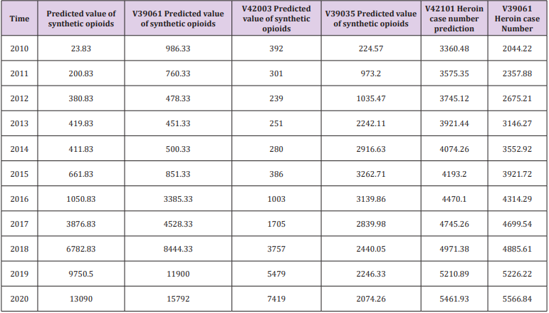
Table 10: Forecast data 1.
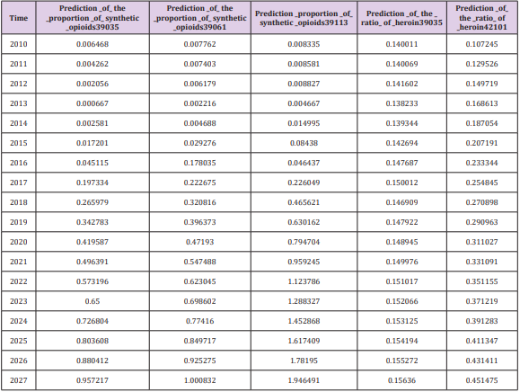
Table 11: Forecast data 2.
Acknowledgement
We would like to express my gratitude to all those who helped us during the writing of this article.
References
- Yang Yuhui, Xu Xiuli, Zhu Zhu (2017) Overview of opioid abuse and its governance in the United States. Chinese Medical Alert 14(12): 746-751.
- Wang Shujiang, Li Weiyan (2016) Dose titration and conversion of opioids in the treatment of cancer pain. Journal of South eastern Defense Medicine 18(5): 522-526.
- Yan Shuai, Dang Yaoguo, Ding Song, Shang Zhongju (2018) Research on panel data clustering method based on grey likelihood function.
- Wu Jian, Liu Zidong, Wang Chao, Zhao Jiaqi, You Yasnfei, et al. (2018) Analysis of resonance characteristics of inverter grid-connected system based on sensitivity theory. Journal of Electric Machines and Control 22(12): 11-29.
- Overdose Death Rates
- Volkow ND, Collins FS (2017) The role of science in addressing the opioid crisis. N Engl J Med 377(4): 391-394.
- Zhao Hailong (2015) Research and application of function substitution method for reliability and reliability sensitivity analysis. Northwestern Polytechnical University
- Xu Chongang, Hu Yuanman, Chang Wei, Jiang Yan, Li Xiuzhen, et al. (2004) Sensitivity analysis of ecological model. Chinese Journal of Applied Ecology 6: 1056-1062.
- Zhu Xiaohua, Yang Xiuchun (2001) Application of analytic hierarchy process in regional eco-environmental quality assessment. Scientific and Technological Management of Land and Resources 5: 43-46.
- Li Xueping (2001) Discussion on the method of scoring index weights by analytic hierarchy process. Journal of Beijing University of Posts and Telecommunications(Social Sciences Edition) 1: 25-27.
- Dang Yaoguo, Hou Yuqing (2016) Multi-indicator panel data clustering method based on feature extraction. Statistics & Decision 19: 68-72.
- Cicero TJ, Ellis MS, Kasper ZA (2017) Increases in self-reported fentanyl use among a population entering drug treatment: The need for systematic surveillance of illicitly manufactured opioids. Drug and Alcohol Depend 177: 101-103.
